A website that steps aside
For an architecture studio in Chianti: typography first, hills that turn into drawings, nothing superfluous.
- Location
- Radda in Chianti
- Role
- Design and development
- Sector
- Architecture
- Status
- Online · tecnochianti.it
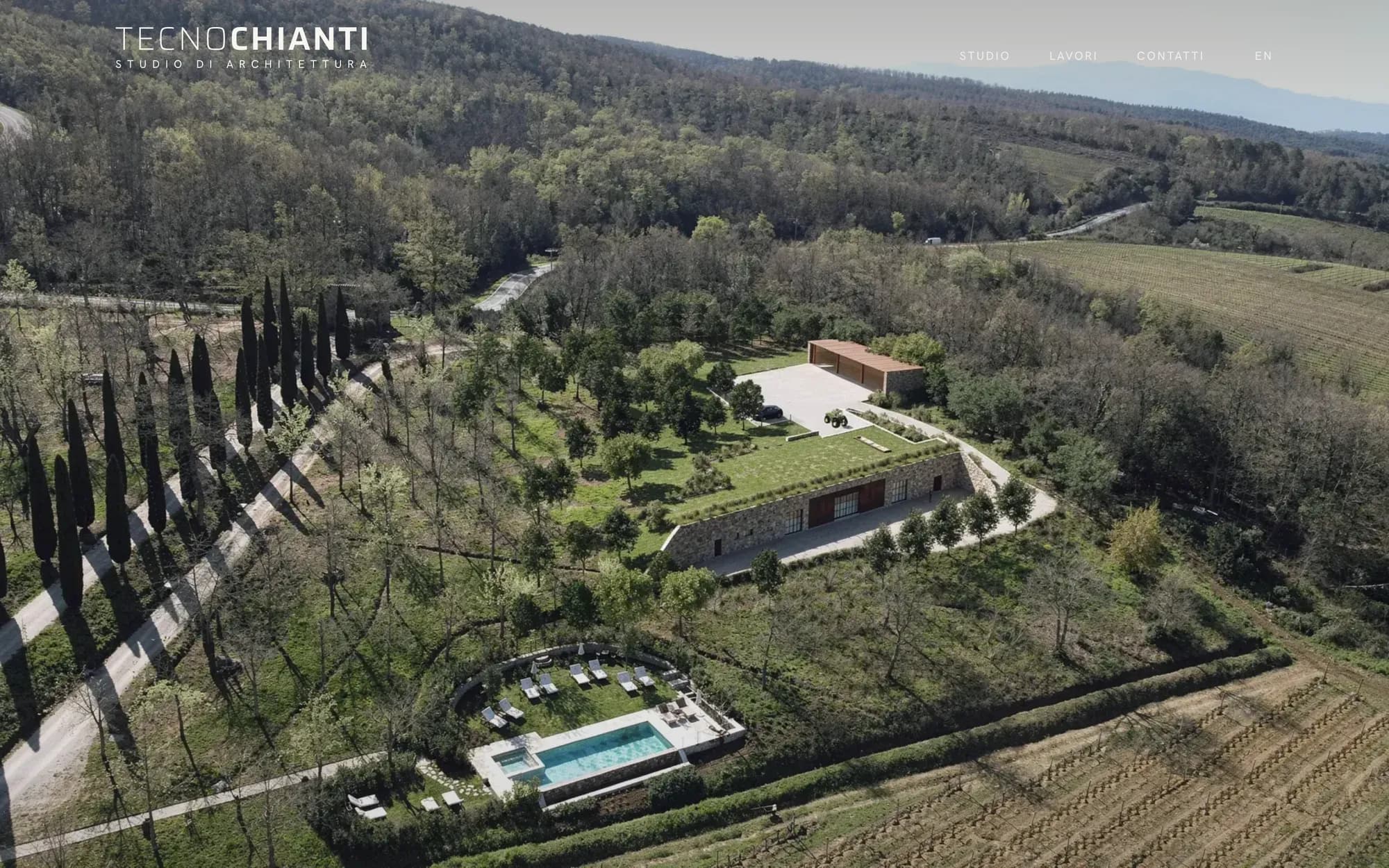
The project
Three professionals, two architects and an industrial engineer, who design private buildings and restore existing heritage in protected landscapes.
They needed a website that presented their work with a formal, confident tone.
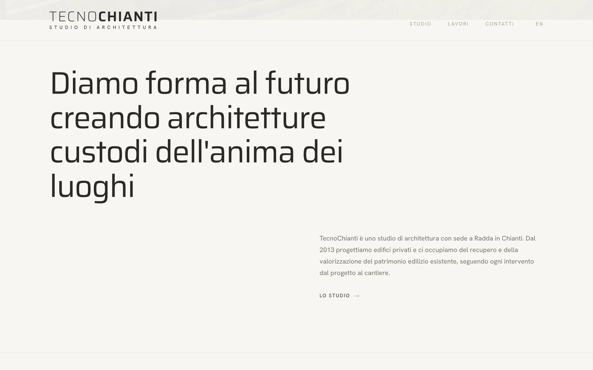
The direction
Typographic architecture: a paper-coloured background, type in the lead role and a single colour, terracotta, used like a stamp.
Paper
#F4F2EE
Terracotta
#B5654A
Saira
Headings and projects
Hanken Grotesk
Body text
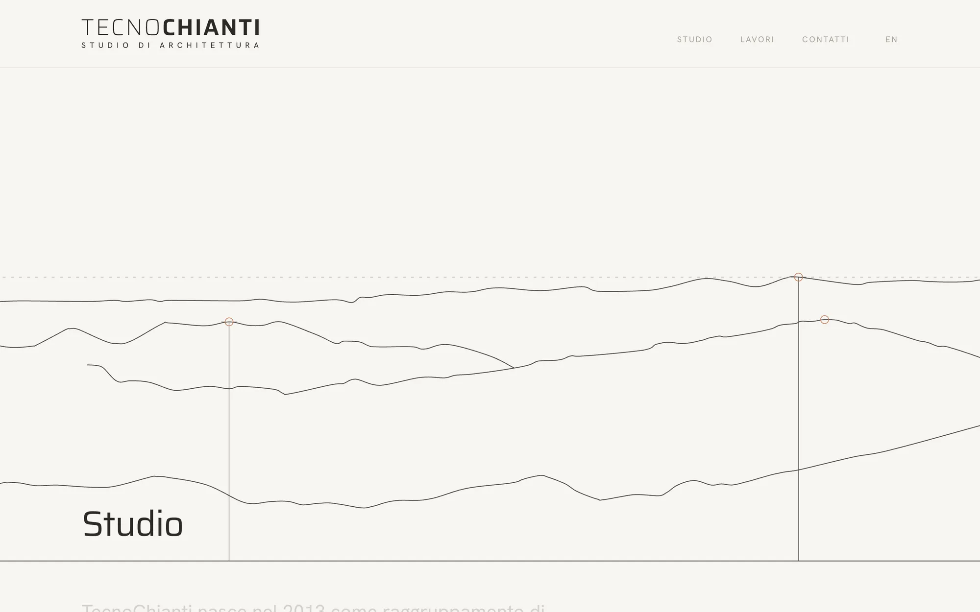
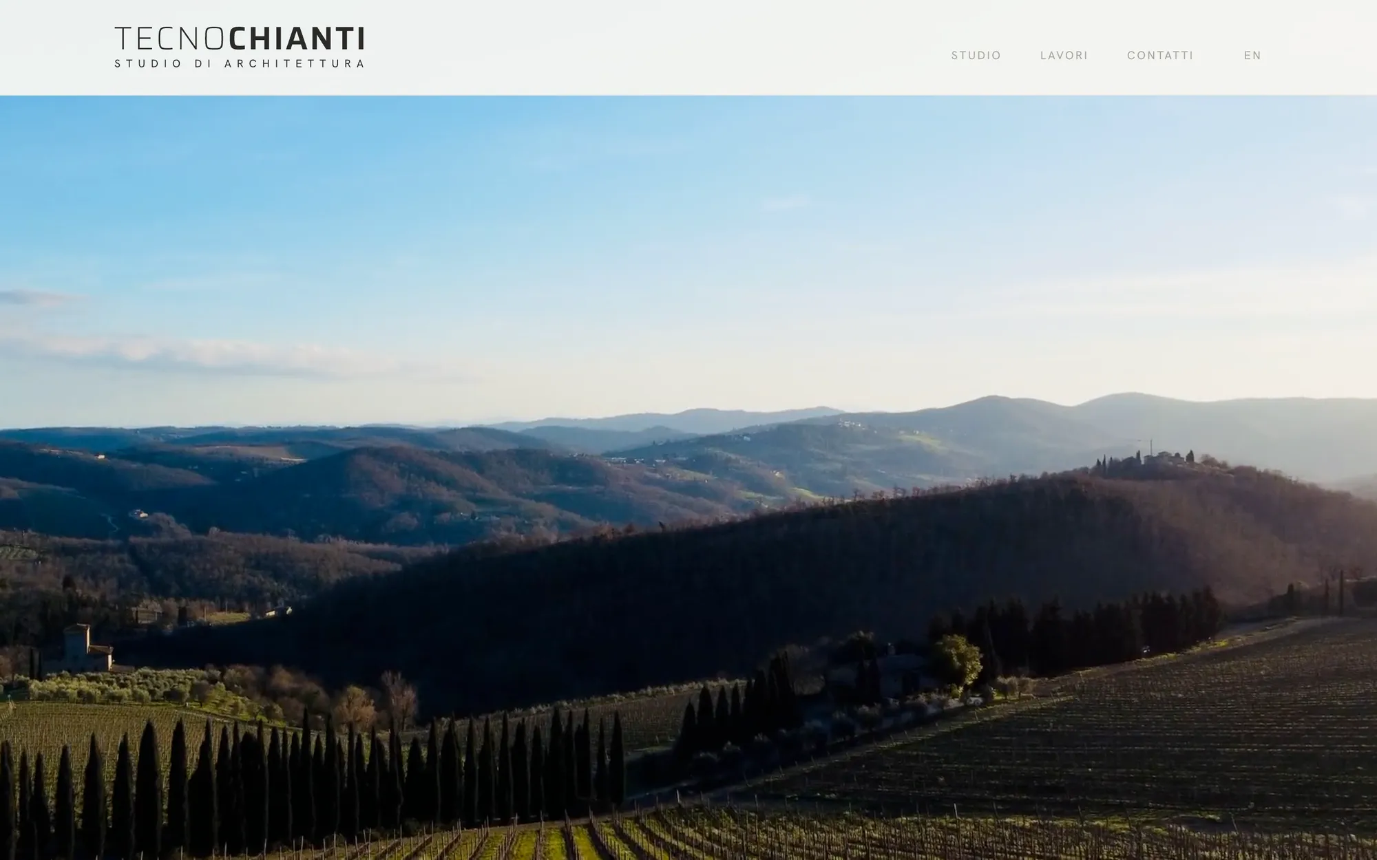
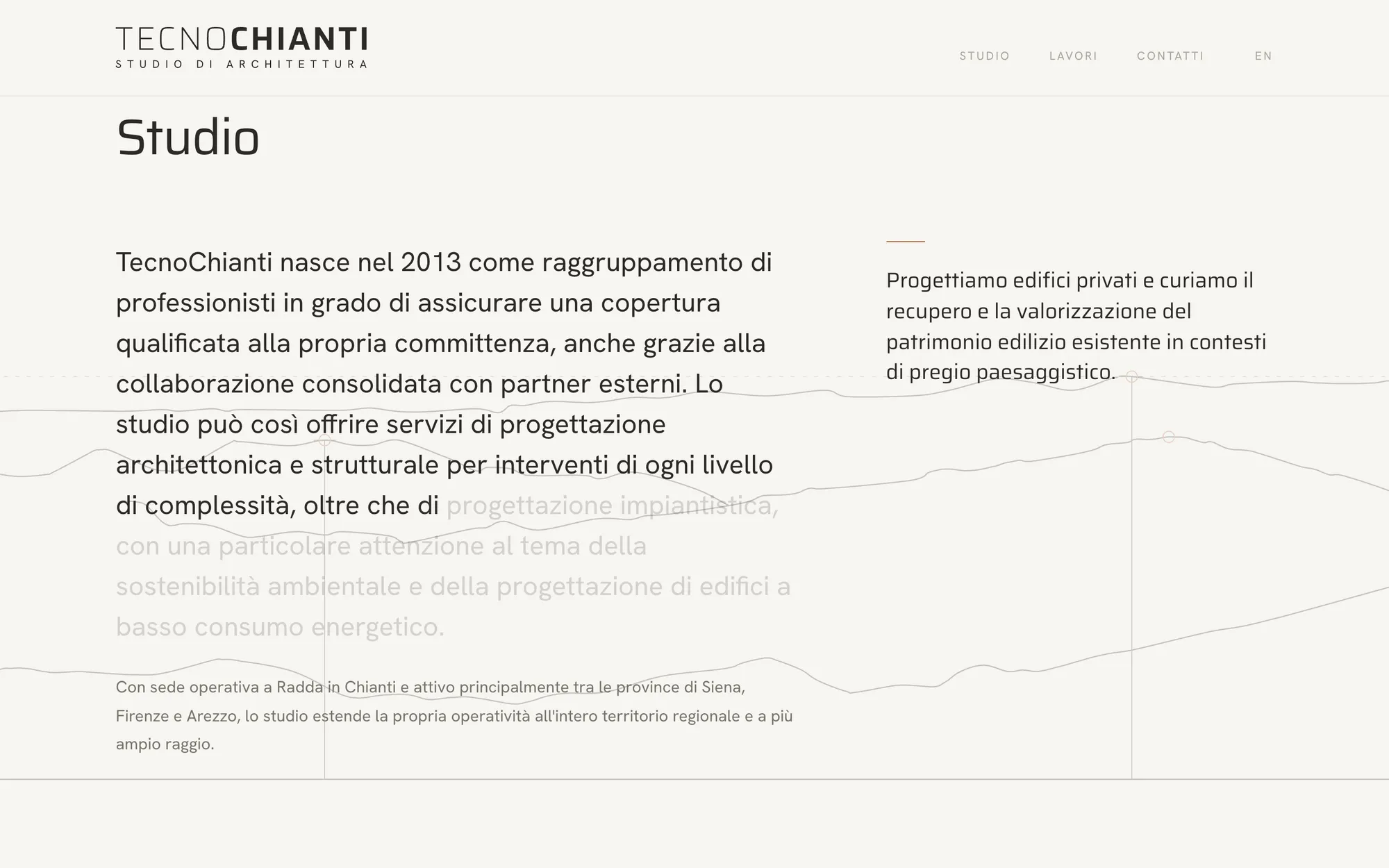
The hills become a drawing
On the Studio page, as you scroll, the landscape video fades to black and white, then to paper, and the ridgelines are drawn like the lines of an architectural plan.
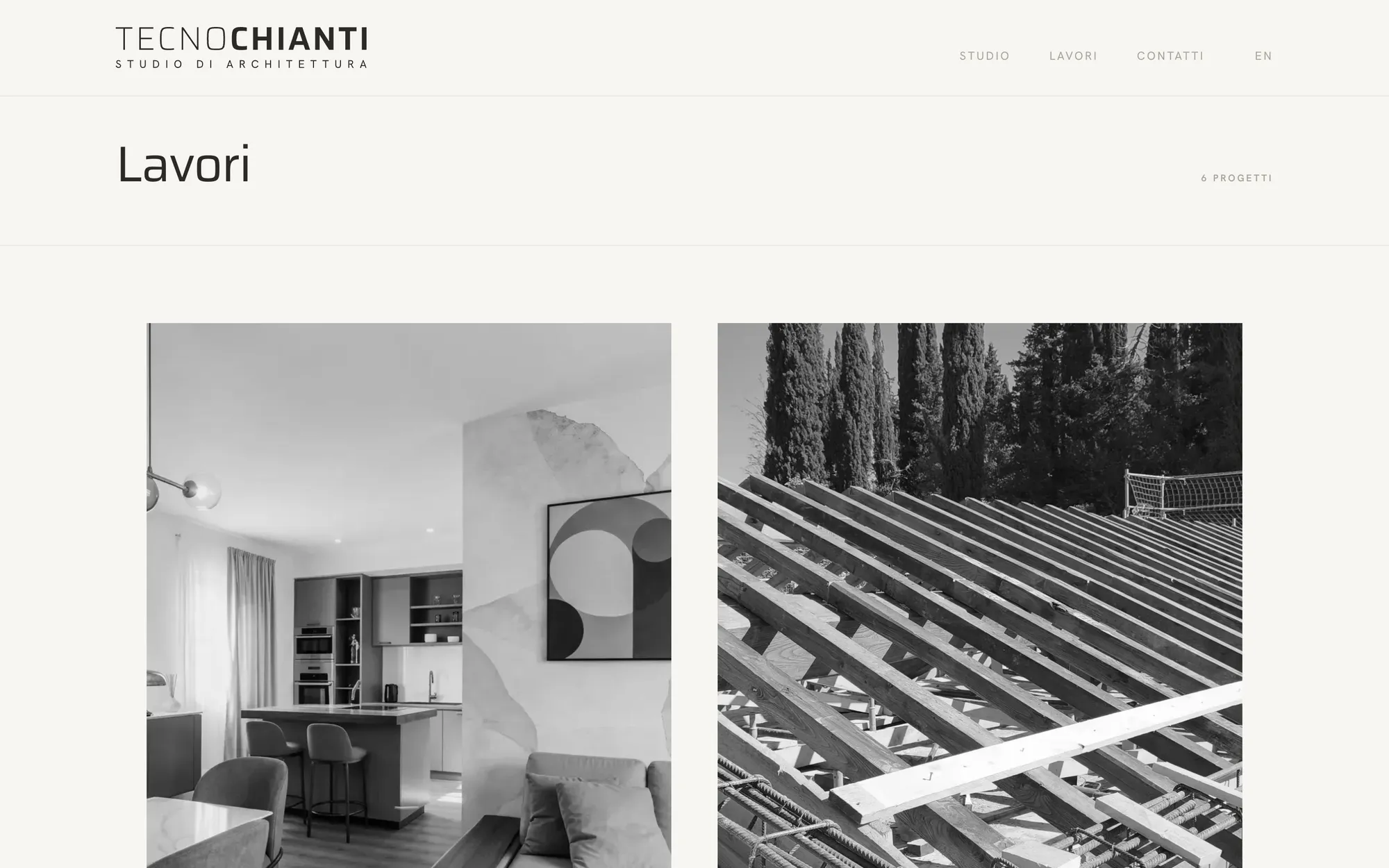
The studio's work
Black and white photos that come into colour on hover. Each project has a concise sheet: location, year, status, type, category, then a description and gallery.
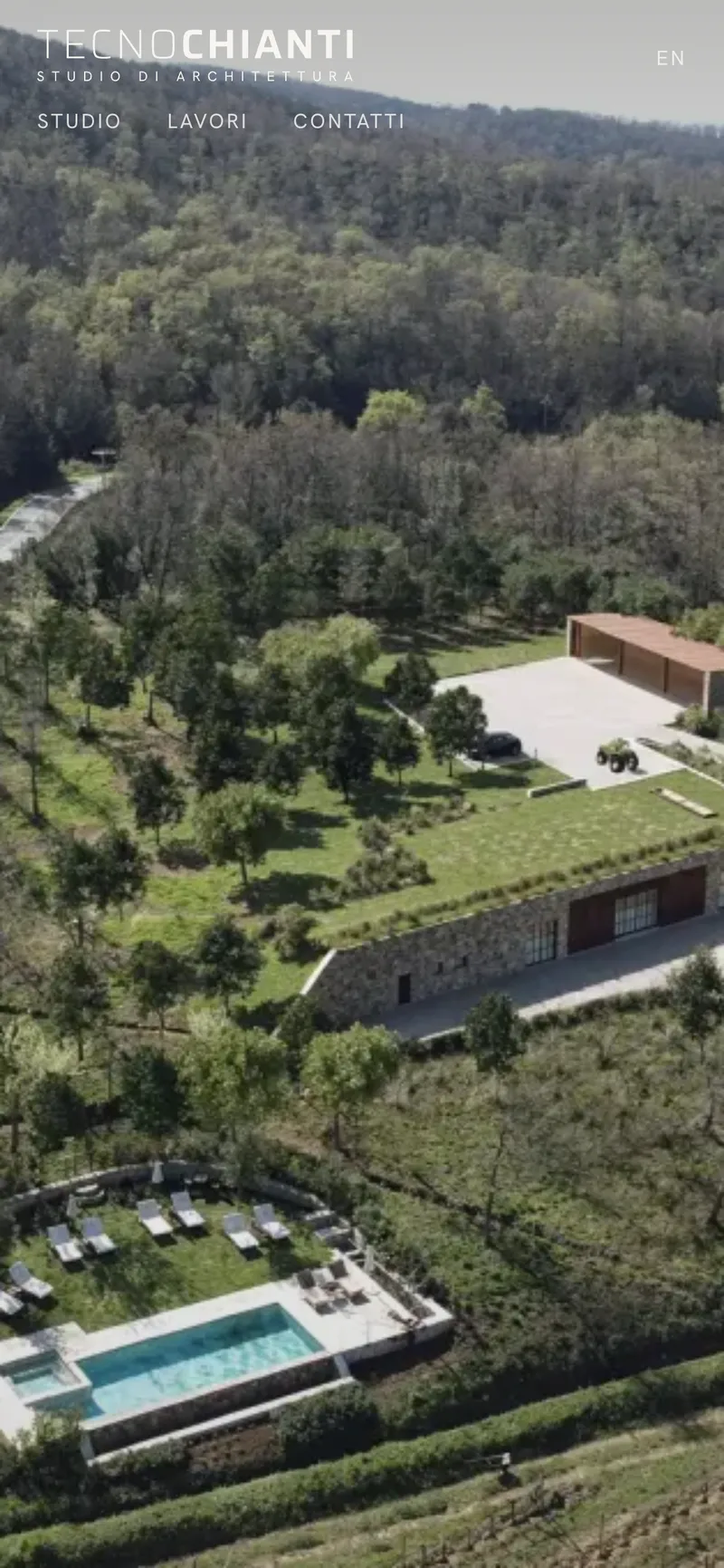
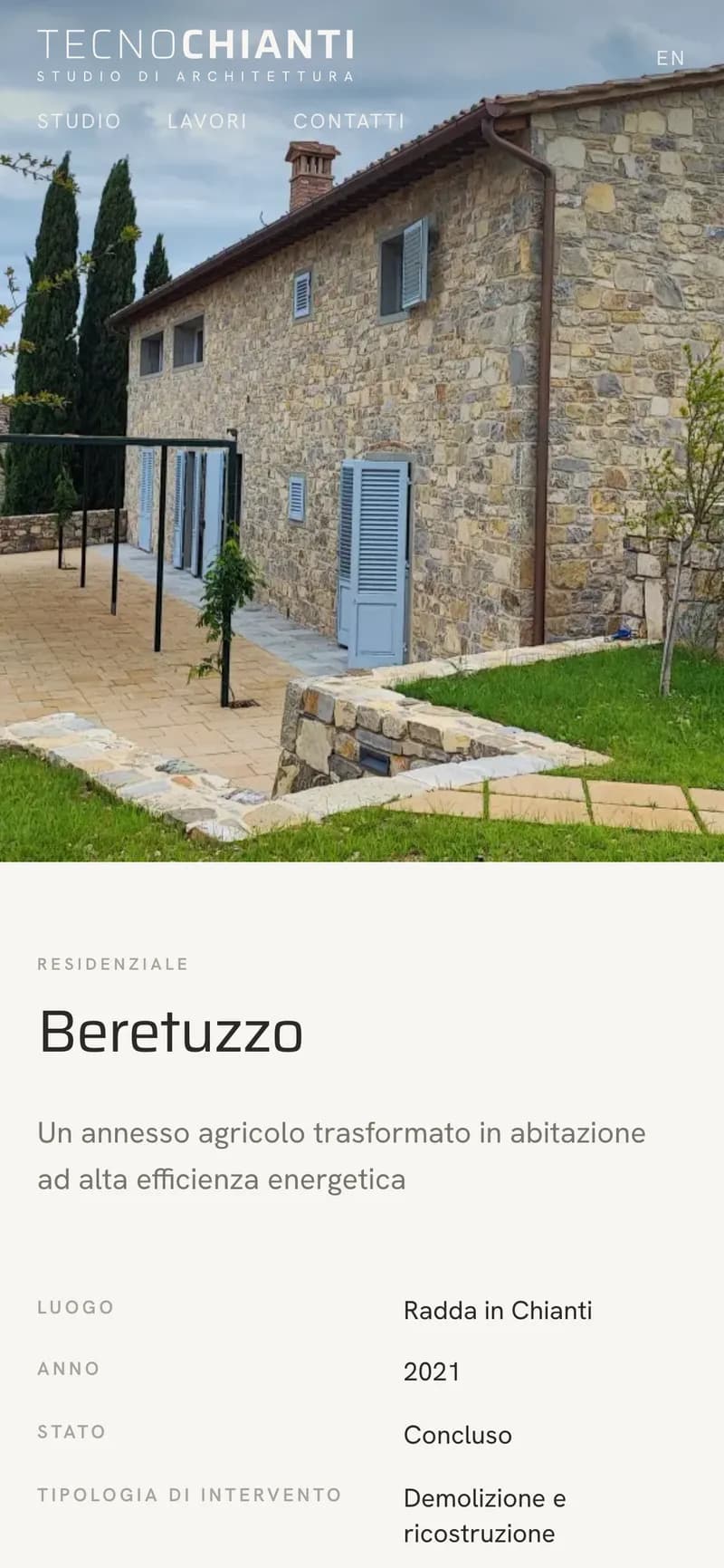
On every screen
Designed for phones too: the same care, the same transitions, the same details.
What you don't see
In Italian and English
Every page has an English version, with translated URLs.
Respects visitors
No tracking without consent. Privacy and cookie policies reviewed by a legal consultant.
Ready for Google
Fast, accessible and structured to be found.